It's just too complicated...
With specific padding, rounding, and tons of other requirements for an Icon to fit in, there's just too many ways to end up with an Icon that looks off.
So how do we prevent this?
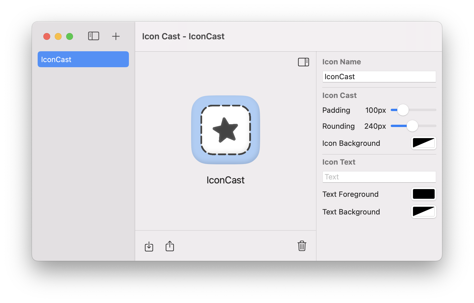
I coded-up a simplistic tool for making your life easier and smoother; doing the heavy lifting of ensuring your icon feels at home with its neighbors for you.
